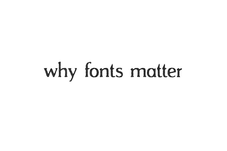
by Kaiser Shaffer, Creative Director
: | •
If the above was a little hard to read, then I think I’ve already proven my point. Fonts do matter.
However, I assume for most people the value of fonts doesn’t extend much further than choosing a font that will make your essay appear longer or satisfy MLA format. But there is something to be said about the fonts we choose and why we choose them.
Robert Bringhurst, author of “The Elements of Typographic Style,” once wrote, “Typography is the craft of endowing human language with a durable visual form.” And it’s true. Everything that humans have printed or typed is preserved in fonts. Typography, this art of selecting fonts, is something that once discovered is hard to ignore, as if someone has told you that you talk way too loud and then for the rest of your life you are left being self conscious about your volume in every situation.
Our fonts give voice to our words and we should strive to use them well. Just as we use different voices depending on which environment and situation we are in, it is equally important to select the right font for the occasion.
Even the much derided Comic Sans has an appropriate usage. It is fun to pick on the black sheep of the font flock, but in the evolution of internet culture, Comic Sans has developed from merely a cliché font used to (loosely) mimic handwriting to a font that signals tongue-in-cheek humor and irreverent memes. Just because something is unpopular doesn’t mean it is voiceless.
That may be a very specific example, but it applies across the board. Serif fonts like the ubiquitous Times New Roman or Garamond (see: Ben Wyatt’s rant about fonts in Parks and Recreation) give a voice of formality and are easier to read. San serif fonts like the ever-popular Helvetica or the Apple-favorite San Francisco work well on screens and give off a cool, casual vibe. This is why Asbury’s logo is set in the serif font Goudy, and the Bistro’s logo is definitely not.
But perhaps one of my favorite things about fonts is that beyond this categorical level, serif this and sans serif that, they become hyper specific about what they say. You can break down fonts into multiple subcategories depending on century, stroke modulation, terminal shape and stress axis. Each difference is like a dialect or accent to the voice they give off. Just like our vocal accents can immediately give away our background, a font’s form and shape reflect its roots. Subconsciously, we judge fonts based on these subtle differences.
All of this just scratches the surface of the world of typography. Some people spend their whole lives dedicated to this study. But if nothing else, maybe the next time you are in charge of putting together a document or graphic, you’ll take an extra moment to survey the fonts around you. Use your voice well.


